【CSS】CSSだけで『かっこいい光るテキストアニメーション』

今回はCSSだけで実装するかっこいいテキストアニメーションをご紹介します。
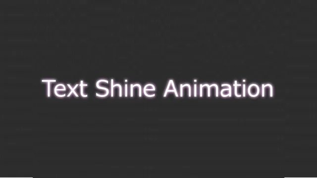
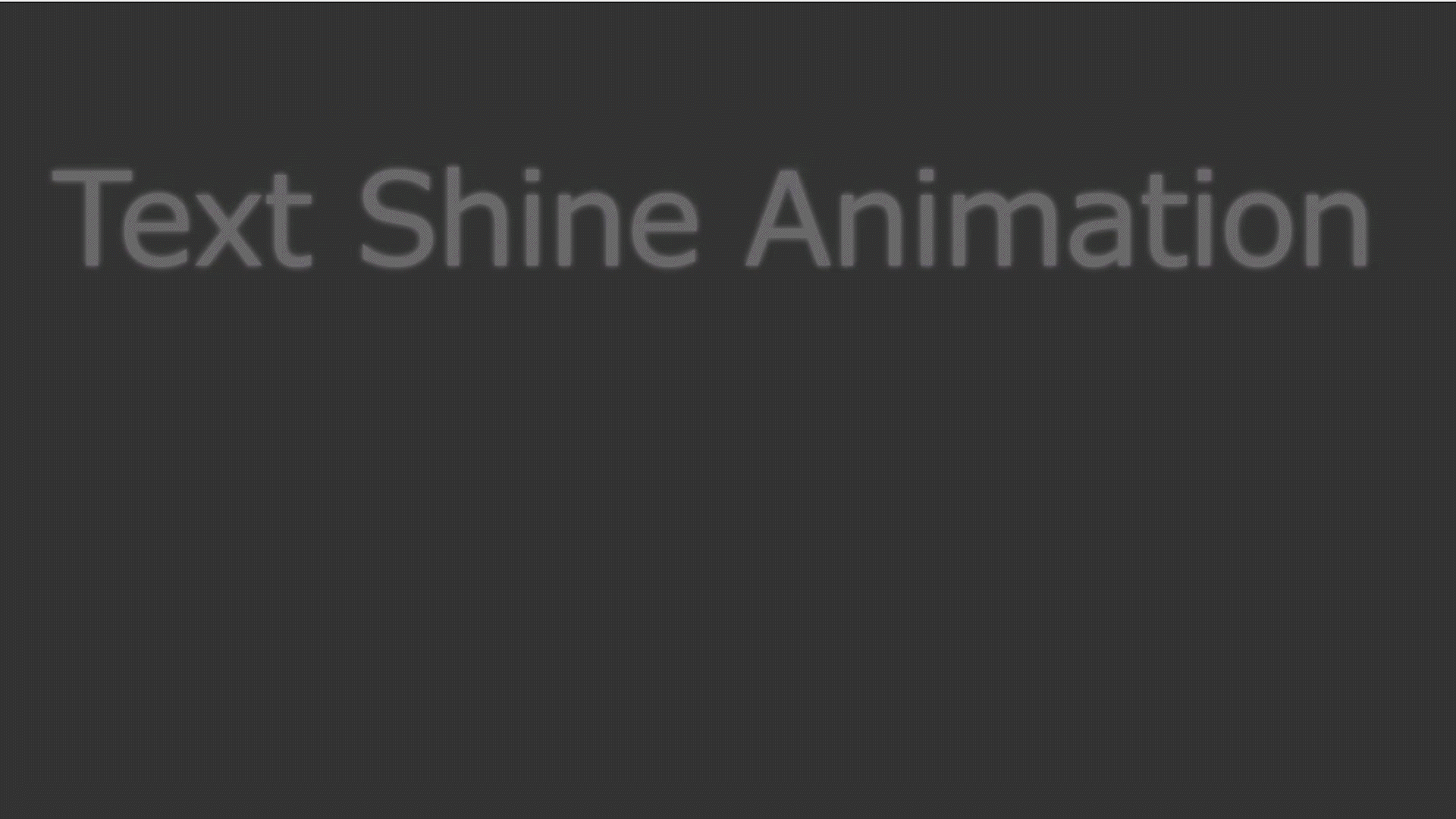
光るテキストアニメーション
ふわっと光るアニメーションです。
HTML
<p class="shineAnime">Text Shine Animation</p>CSS
body {
  background-color: #333;
}
.shineAnime{
  color: #fff;
  font-size: 4rem;
  animation-name:shine;
  animation-duration: 1s;
  animation-timing-function: ease-out;
  animation-fill-mode: forwards;
  }
@keyframes shine{
	0% { opacity:0; text-shadow: 0 0 0 #fff,0 0 0 #fff;}
	50% { opacity:1;text-shadow: 0 0 10px #fff,0 0 15px #fff; }
	100% { opacity:1; text-shadow: 0 0 0 #fff,0 0 0 #fff;}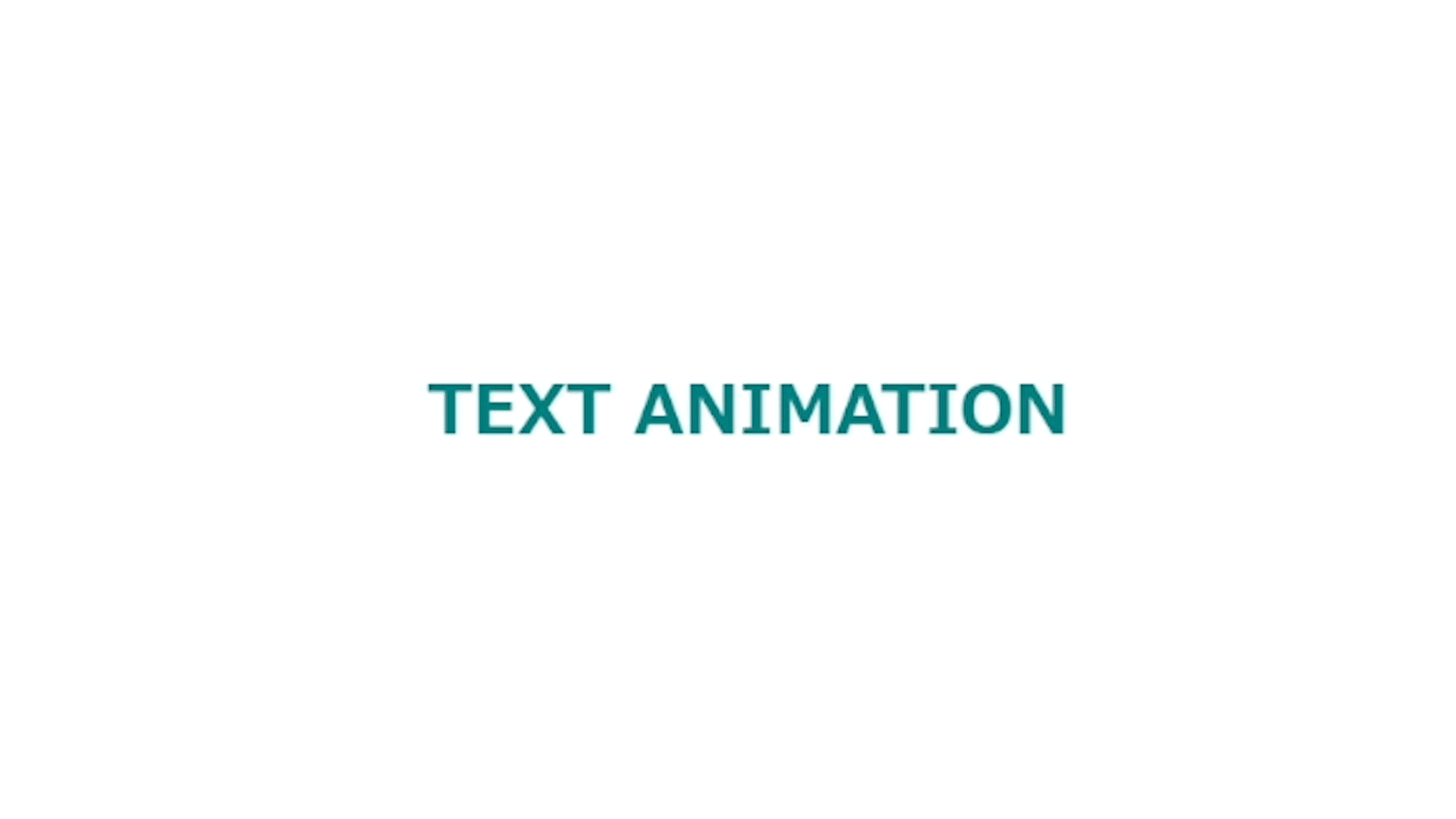
}ピンクに光り続けるテキストアニメーション
ほんのり光り続けるアニメーションです。
HTML
<div id="container">
  <p class="Headline">TEXT ANIMATION</p>
  <p class="border"></p>
</div>
CSS
body {
  background-color: #333;
  text-align: center;
}
.shineAnime{
  color: #fff;
  font-size: 4rem;
  animation-name:shine;
  animation-duration: 1s;
  animation-timing-function: ease-out;
  animation-fill-mode:forwards;
  }

@keyframes shine{
	0% { opacity:0; text-shadow: 0 0 0 #fff,0 0 0 #fff;}
	50% { opacity:1;text-shadow: 0 0 10px #fcf,0 0 15px #fcf; }
	100% { opacity:1; text-shadow: 0 0 5px #fcf,0 0 5px #fcf;}
}
ラインから現れるテキストアニメーション
ラインが消えると現れるテキストアニメーション
HTML
<div class="parentLeft bgLine"><span class="childLeft">TEXT ANIMATION</span></div>テキスト(子要素)を背景(親要素)で囲む
CSS
/*背景(テキストの親)*/
.parentLeft{
  width: 200px;
	box-sizing:border-box;
	animation-name:LIneAnime1;
	animation-duration:1s;
	animation-fill-mode:forwards;
	position: relative;
	overflow: hidden;/*はみ出た色要素を隠す*/
	opacity:0;
  margin: 0 auto;
  text-align: center;
}
@keyframes LIneAnime1{
  from {
    opacity:0;
  }
  to {
    opacity:1;
}
}
/*出てくるテキスト*/
.childLeft{
  font-weight: bold;
  color: teal;
	animation-name:innerText;
	animation-duration:1s;
	animation-delay: 0.5s;/*テキストは少し遅れて出てくる*/
	animation-fill-mode:forwards;
	opacity: 0;
}
@keyframes innerText{
	0% {
	opacity: 0;
	}
	100% {
	opacity: 1;
}
}
.bgLine::before{
	animation-name:Line;
	animation-duration:1s;
	animation-fill-mode:forwards;
  animation-timing-function: ease-in-out;
    content: "";
    position: absolute;
    width: 100%;
    height: 100%;
    background-color: teal;/*伸びる背景色*/
}
@keyframes Line{
	0% {
		transform-origin:left;/*変形の中心を左に指定*/
		transform:scaleX(0);/*要素の拡大縮小(0)で非表示*/
	}
	50% {
		transform-origin:left;
		transform:scaleX(1);/*左から元のサイズに*/
	}
	50.001% {
		transform-origin:right;
	}
	100% {
		transform-origin:right;/*変形の中心を右に指定*/
		transform:scaleX(0);/*要素の拡大縮小(0)で非表示*/
	}
}下から出現するテキストアニメーション
ラインが伸びると下からテキストが現れます
HTML
<div id="container">
  <p class="Headline">TEXT ANIMATION</p>
  <p class="border"></p>
</div>
CSS
/*線アニメーション*/
#container {
  width: 200px;
  margin: 0 auto;
}
.border{
	position: relative;
	text-align:center;
	font-size: 18px;
  margin: 0;
}
.border:before{
	content: '';
	position: absolute;
	left: 50%;
	bottom: 0;
	width: 0;
	border-bottom: solid 1px #000;
	transform: translateX(-50%);
	animation-name: border_anim;
  animation-duration:0.7s;
  animation-timing-function: ease-in-out;
  animation-fill-mode:forwards;
}
@keyframes border_anim {
	0%{
		width: 0%;
	}
	100%{
		width: 100%;
	}
}
/* textアニメーション */
.Headline{
  margin: 0;
  animation-name: SlideIn ;
  animation-duration: 0.7s;
  animation-delay: 0.5s;
  animation-fill-mode: forwards;
  opacity: 0;
}
@keyframes SlideIn {
  0% {
    opacity: 0;
    transform: translateY(24px);
  }
  50% {
    opacity: 0;
    transform: translateY(12px);
  }
75% {
    opacity: 0;
    transform: translateY(6px);
  }
  100% {
    opacity: 1;
    transform: translateY(0);
  }
}
まとめ
 https://www.beginavi.net/htmlcsscss-button/
そのほかの記事
同じカテゴリの記事一覧へ
もっとCSSアニメーションを学びたい方に本当におすすめする本「動くWebデザインアイデア帳」