【CSS】CSSだけで動きをつけるanimationの使い方
cssだけでサイトに動きをつけるanimationについてご質問がありましたのでご紹介します。
★この記事の目次★
animationは動きをつけるCSSプロパティ
Webサイトに動きをつけるというと「JavaScript」や「jQuery」といったものを考えると思いますが、cssでもこのような動きを簡単に表現することができます。
今回はcssで動きを実装できるanimationプロパティについてみていきましょう。
animationプロパティの使い方
上のような四角を丸に変化させるアニメーションを作成してみましょう。
四角から丸に変化するアニメーション
HTML
<div class="square"></div>
css
.square {
  width: 500px;
  height: 500px;
  background-color: #fcf;
  animation-name:Change ;/*アニメーションの名前を指定する*/
  animation-duration: 3s;/*どのくらいの時間アニメーションするか*/
  animation-iteration-count: 1;/*ループ回数*/
}
@keyframes Change {/*アニメーションの名前はanimation-nameと同じにする*/
  from {
    border-radius: 0%;
  }
  to {
    border-radius: 50%;
  }
}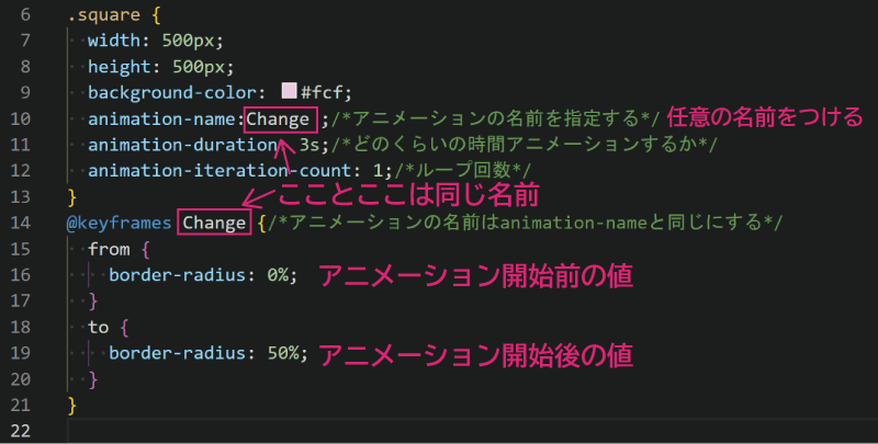
このように指定すると四角から丸に変化するアニメーションができます。
animationプロパティについて
animation-name:アニメーションの名前を指定するプロパティ
animation-duration: アニメーションの長さを指定する
animation-iteration-count:何回繰り返すか
@keyframesで動きを指定
このようにすることもできます。
さらに色も変化させてみる
HTML
<div class="square"></div>
css
.square {
  width: 500px;
  height: 500px;
  background-color: #fcf;
  animation-name:Change,colorChange ;/*カンマで複数指定できる*/
  animation-duration: 3s;/*どのくらいの時間アニメーションするか*/
  animation-iteration-count:2;/*ループ回数*/
}
@keyframes Change {/*アニメーションの名前はanimation-nameと同じにする*/
  from {
    border-radius: 0%;
  }
  to {
    border-radius: 50%;
  }
}
@keyframes colorChange {/*アニメーションの名前はanimation-nameと同じにする*/
  from {
    background-color: #fcf;
  }
  to {
    background-color: #cfc;
  }
}
このようにカラーとサイズをアニメーションさせることができました。
Liquidアニメーション
このようにLiquidアニメーションを表現することもできます。
.square {
  width: 500px;
  height: 500px;
  background-color: #fcf;
  animation-name:Change,colorChange ;/*アニメーションの名前を指定する*/
  animation-duration: 30s;/*どのくらいの時間アニメーションするか*/
  animation-timing-function: ease;
  animation-iteration-count:2;/*ループ回数*/
}
@keyframes Change {/*アニメーションの名前はanimation-nameと同じにする*/
  0%, 100% {
    border-radius: 0% ;
}

28% {
    border-radius: 37% 37% 63% 63%;
}
42% {
    border-radius: 47% 44% 56% 53%;
}
56% {
    border-radius: 52% 36% 64% 48%;
}
70% {
    border-radius: 44% 42% 58% 56%;
}
84% {
    border-radius: 51% 49% 51% 49%;
}

}

@keyframes colorChange {/*アニメーションの名前はanimation-nameと同じにする*/
  from {
    background-color: #fcf;
  }
  to {
    background-color: #cfc;
  }
}
animationを使うシーン
アニメーションはどのようなシーンで使うのでしょうか?
ページトップボタン
このようにふわふわした動きを「TOP」へ戻るボタンに適用することもできます。
HTML
<p id="page-top"><a href="#">Top</a></p>CSS
@charset "utf-8";
/*リンクの形状*/
#page-top a{
	display: flex;
	justify-content:center;
	align-items:center;
	background:teal;
	border-radius: 50%;
	width: 100px;
	height: 100px;
	color: #fff;
	text-align: center;
	text-transform: uppercase;
	text-decoration: none;
	font-size:2rem;
  transition:all 0.3s;
}
#page-top a:hover{
	background: rgb(3, 176, 176);
}
#page-top {
	position: fixed;
	right: 300px;
	bottom: 300px;
  animation-name: move;/*任意の名前*/
  animation-duration: 1s;/*どのくらいでアニメーションさせるか*/
  animation-timing-function: ease-in-out;/*なめらかに*/
  animation-iteration-count: infinite;/*ずっと繰り返す*/
}
@keyframes move{
  0%{bottom:20px;}
  50%{bottom:25px;}
 100%{bottom:20px;}
}
ふわっと出てくる画像
HTML
 <div class="container">
  <div class="box fadeIn">img1</div>
  <div class="delay1 box fadeIn">img2</div>
  <div class="delay2 box fadeIn">img3</div>
  </div>
CSS
.container {
  width: 1000px;
  display: flex;
  margin: 0 auto;
}
div.box {
  background-color: #d98293;
  width: 200px;
  height: 100px;
  line-height: 100px;
  font-size: 3rem;
  margin: 20px;
  padding: 10px;
  color: #fff;
  text-align: center;
}
.delay1 {
  animation-delay: 0.3s;
}
.delay2 {
  animation-delay: 0.6s;
}
.box {
  opacity: 0;
}
.fadeIn {
  animation-name: fadeIn;
  animation-duration: 0.5s;
  animation-timing-function: ease;
  animation-fill-mode: forwards;
  opacity: 0;
}
@keyframes fadeIn {
  from {
    opacity: 0;
    transform: translateY(100px);
  }
  to {
    opacity: 1;
    transform: translateY(0);
  }
}
animation-timing-function:表示する速度の指定
ここで出てきたanimation-timing-functionについてみていきましょう。
animation-timing-function: ease;
なめらかにアニメーション
animation-timing-function:ease-in;
ゆっくり開始
animation-timing-function:ease-in-out;
ゆっくり開始、ゆっくり終了
animation-timing-function:ease-out;
ゆっくり終了
animation-timing-function:step-end;
はじめは変化しないで一気に終了する
アニメーションによっては直線的な動きよりもなめらかに動くと気持ちの良い動きになるのでいろいろ試してみると良いでしょう。
まとめ

もっとjQueryやCSSアニメーションを学びたい方におすすめの本「動くWebデザインアイデア帳」
ほんとうにおすすめ
 https://www.beginavi.net/css-transition/
同じカテゴリの記事一覧へ